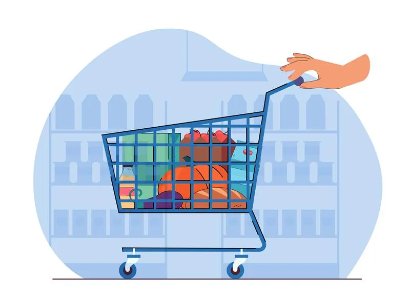
The world of online shopping is getting competitive day by day, and in this era, one of the constant challenges for E-commerce is cart abandonment. You have spent time designing attractive product pages, crafting compelling offers, and driving traffic to your site; however, many visitors add products to their cart and then leave without making a purchase. This not only affects the revenue but also reduces the overall efficiency of your sales funnel.
In 2026, this issue will be more critical, as shoppers, particularly Gen Z, expect seamless, frictionless experiences across devices. To tackle this problem, businesses must focus on e-commerce conversion rate optimization, enhancing mobile checkout user experience, and implementing effective cart abandonment recovery strategies. Shoppers no longer tolerate slow, confusing, or multi-step checkout processes. They want fast, clear, and secure experiences that require minimal effort.
Understanding the new buyer behaviour, optimising mobile checkouts, and reducing friction through intelligent UX design are now non-negotiable for any online retailer hoping to maximise conversions. Let’s explore each of these areas in detail.

Understanding the New Buyer Journey
The online shopping journey in 2026 is radically different from what it was even five years ago. Customers are more informed, mobile-savvy, and experienced. They expect a shopping journey that is smooth, secure, and hassle-free.
The modern buyer journey typically consists of stages:
1. Discovery: At this stage, the explorer first comes across your product. They may have seen the product on any social media app, through promotions, or directly via a search engine. At this stage, the goal is to capture the person’s attention and create an interest in their mind without overwhelming them. Clear product images, compelling headlines, and simple navigation are essential to encourage exploration
2. Consideration: Once the person is aware of your product, they begin to evaluate its value. This includes reading reviews, comparing your product to those of competitors, checking prices, and evaluating shipping options. It is essential that your website provides transparent and accessible information at this stage. The more easily a shopper can find details, the more likely they are to move forward.
3. Decision: Adding a product to the cart is the first step toward conversion, but hesitation often occurs at this stage. Shoppers may abandon their cart due to concerns about cost, delivery time, or a lack of trust in your site. Ensuring transparency about additional fees, shipping, and return policies is crucial at this stage to reduce uncertainty.
4. Purchase: This is the moment when the shopper completes the transaction. A smooth and quick checkout process is key here. Any unnecessary clicks, confusing forms, or slow loading times can lead to abandonment, even if the customer is otherwise ready to make a purchase.
5. Post-Purchase Engagement: Even after the purchase, communication remains important. Confirmation emails, delivery tracking, and follow-ups about future offers or loyalty programs strengthen trust and encourage repeat purchases. A positive post-purchase experience can convert one-time buyers into lifelong customers.
Challenges in the modern buyer journey include:
- High expectations from the Gen Z shoppers: Younger audiences have grown up with technology and expect near-instant gratification. Slow processes, multiple steps, or poorly designed interfaces can easily drive them away.
- Multi-device usage: Many shoppers start browsing on one device, like a phone, and finish on another, such as a laptop. Consistency across the devices is essential to avoid cart abandonment.
- Information overload: Too many choices, unclear navigation, or cluttered product pages increase cognitive load and can make the shopper indecisive, ultimately causing them to leave the cart.
By understanding these stages and challenges, businesses can better identify where users are dropping off and develop strategies to convert browsers into buyers. This is where mobile checkout UX and cart abandonment recovery play pivotal roles in e-commerce conversion rate optimization.
Mobile Checkout Optimization Tactics
Mobile commerce is no longer an option; it is the foundation of modern e-commerce. As mobile traffic grows, the quality of the mobile checkout UX becomes a major factor in determining whether shoppers complete their purchases. Mobile shopping has unique challenges, including smaller screens, touch-based interactions, and varied internet speeds. Optimising the mobile experience can significantly reduce cart abandonment.
1. Simplify the Checkout Process:
- Minimise steps to completion: Every extra click, page, or form field increases friction. Considering consolidating shipping, payment, and confirmation into a single page. When shoppers can complete a purchase without having to jump through multiple hoops, conversion rates improve significantly.
- Guest checkout options: Forcing users to create an account before making a purchase can be a significant barrier, especially for younger audiences. Offering guest checkout lets shoppers complete their purchases quickly, which is particularly important for impulse buying scenarios.
- Auto-fill forms and innovative suggestions: Returning customers should not have to re-enter details every time. Use auto-fill capabilities for names, addresses, and payment methods. For new users, providing predictive suggestions (like city or postcode auto-completion) reduces effort and frustration.
2. Enable One-Click Payments
- Digital wallets for speed and security: Integration with Apple Pay, Google Pay, and PayPal One Touch enables instant checkout. This simplifies the payment experience and reduces the likelihood of abandoned carts.
- Save payment details securely: Offering secure storage of payment information for returning customers can dramatically shorten the checkout process and encourage repeat purchases.
- Highlight convenience and trust: Clearly communicate that one-click payment options are secure and easy, reassuring customers who may otherwise hesitate to save their payment information online.
3. Optimise Page Speed
- Fast loading is critical: Mobile users expect pages to load in a few seconds. Compress images, minimize unnecessary scripts, and utilize caching to enhance speed. Slow load times are one of the top reasons for cart abandonment.
- Content delivery networks (CDNs): Serving content through CDNs ensures that pages load quickly regardless of the user’s location. This is particularly important for global e-commerce businesses.
- Lazy loading for efficiency: Load only what’s visible to the user at first, and defer non-essential elements. This creates a faster, smoother experience.
4. Design for Mobile Usability
- Large, tappable buttons: Ensure that buttons for adding items to the cart or completing the purchase are easily accessible and easy to tap. Small buttons on mobile screens can frustrate users and cause errors.
- Simple forms with logical flow: Forms should be easy to navigate, with automatic keyboard navigation for fields such as email, phone number, or postcode. Minimising typing effort reduces errors and increases conversion likelihood.
- Visual hierarchy for clarity: Highlight the most important elements like total cost, checkout button, and shipping options, while reducing clutter and distractions.
5. Provide Clear Cost Transparency
- Upfront cost display: Avoid surprises by showing shipping fees, taxes, and discounts early in the checkout process. Surprises often lead to abandonment.
- Explain delivery options: Provide precise details about standard and expedited shipping, including costs and estimated delivery times.
- Show incentives prominently: If you offer discounts, free shipping thresholds, or loyalty rewards, display them clearly to reassure customers they are getting value.
| Mobile Checkout Element | Best Practice | Expected Outcome |
| Form Fields | Minimal, auto-fill enabled, error validation | Faster checkout and fewer abandoned forms |
| Payment Options | Multiple, one-click-enabled, clearly displayed | Higher conversion rates and repeat purchases |
| Page Load Speed | <3 seconds, optimised images, CDN use | Reduced mobile cart abandonment |
| CTA Buttons | Large, intuitive, visually prominent | More completed checkouts and better user satisfaction |
Reducing Cognitive Load with Smart UX
Cognitive overload is one of the main reasons shoppers abandon their carts. A cluttered interface, confusing steps, or too many options overwhelm the brain, making it harder for the buyers to make decisions. Smart UX reduces friction, guides users, and makes shopping effortless.
Practical Ways to Reduce Cognitive Load
- Simplified Navigation: Remove unnecessary menus, pop-ups, and links during the checkout process. Focus solely on completing the purchase. This focused experience reduces distraction and accelerates decision-making.
- Progress indicators: Show users exactly where they are in the checkout process with step-by-step indicators such as “Shipping → Payment → Review → Complete.” This provides clarity, reduces anxiety, and sets expectations.
- Visual clarity: Consistent fonts, colour schemes, and spacing can guide the shopper’s eyes naturally to important actions like “Proceed to Payment.” Visual cues are essential to make the journey intuitive.
- Contextual assistance: Include tooltips, help buttons, or live chat near complex fields, such as credit card inputs or address forms. This helps users complete forms confidently without leaving the page.
- Trust signals: Display security badges, SSL certificates, and return policies prominently. Highlight guarantees such as “30-day returns” or “money-back guarantee” to reassure hesitant buyers.
Additional strategies to make UX intuitive include:
- Icons and visuals: Use universally recognised symbols, such as a shopping cart or padlock, to visually communicate actions.
- Short, clear instructions: Avoid long paragraphs and jargon. Clear, concise guidance keeps the focus on completing the purchase.
- Logical grouping: Group related actions together, such as combining shipping and payment sections, to simplify decision-making and enhance clarity.
- Subtle urgency cues: Highlight low stock levels or limited-time offers, but without creating stress. These cues can nudge buyers toward completion.
Case Study: How a brand Recovered 40% of lost sales
A mid-sized fashion brand observed a cart abandonment rate of 68%, with the highest drop-offs occurring during mobile checkout. Their analysis revealed several pain points: A long, multi-step checkout, limited payment options, and unclear shipping costs.
Strategies Implemented:
- Streamlined Checkout: The checkout process was reduced from six steps to three, and guest checkout options were implemented.
- One-click Payment: Digital wallets like Apple Pay and Google Pay were integrated, allowing for instant purchases.
- Transparent Costs: Shipping, Taxes, and fees were displayed upfront to prevent unpleasant surprises.
- UX Redesign: Forms were simplified, progress indicators were added, and visual cues guided the user seamlessly through checkout.
- Automated Cart Recovery: Personalised reminder emails were sent to users who abandoned carts, often with small incentives such as discounts or free shipping.
Results
- 40% of abandoned carts were successfully recovered.
- Mobile conversions increased by 32%.
- Average checkout completion time reduced by 50%, leading to a faster, smoother experience.
- Customer satisfaction improved, with positive feedback about the simplicity and speed of the checkout process.
Key Takeaway: Even minor, focused improvements in UX design, mobile optimisation, and cart recovery strategy can result in significant revenue recovery.
Emerging Trends for 2026
The e-commerce landscape in 2026 is shaped by the expectations of Gen Z shoppers. To ace in the competition retailers should stay ahead of these trends.
- Frictionless One-Click Checkouts: Speed and convenience are paramount. Shoppers expect purchases to happen with minimal steps.
- AI-Powered Personalisation: Predictive recommendations, personalised offers, and smart product suggestions drive engagement.
- Seamless Multi-Device Experience: Buyers often start on one device and complete purchases on another. Consistency is key.
- Social Commerce Integration: Platforms like Instagram, TikTok, and Snapchat influence buying behaviour and provide new purchase pathways.
- Sustainable and Ethical Shopping: Eco-friendly packaging, transparent sourcing, and corporate responsibility are becoming purchase drivers for younger audiences.
Retailers who embrace these trends can significantly reduce cart abandonment while boosting overall sales and customer loyalty.
Practical Tips to Boost Conversions
To tackle abandonment in 2026, businesses can implement the following:
- Optimise Mobile Checkout: Focus on mobile usability and speed to meet Gen Z expectations.
- Use Retargeting Campaigns: Email and push notifications can remind shoppers of abandoned carts.
- Offer Multiple Payment Options: Include digital wallets, BNPL solutions, and traditional cards.
- Continuous Testing: Regular A/B testing of checkout flows, CTA buttons, and messaging can reveal what works best.
- Incentivise Completion: Offer small discounts, free shipping, or loyalty rewards to encourage purchases.
Remember, the goal is to make the checkout process predictable, intuitive, and reassuring, while simultaneously building trust and loyalty.
Frequently Asked Questions
1. What is cart abandonment recovery, and why is it important?
Cart abandonment recovery involves strategies to encourage shoppers who leave without completing a purchase to return and finalise their transaction. It is critical because it directly influences revenue and overall e-commerce conversion rate optimization.
2. How can I improve mobile checkout UX?
Simplify forms, reduce steps, enable one-click payments, and optimise for speed and visibility on smaller screens. Transparent cost displays and smooth navigation also improve UX.
3. What role does UX play in reducing cart abandonment?
Effective UX reduces cognitive load, simplifies decision-making, and reassures shoppers, making it more likely they will complete purchases.
4. Are personalized messages effective in recovering cart abandonments?
Yes. Personalised messages that remind users of abandoned items or offer incentives significantly improve recovery rates.
5. Can one-click checkout really improve conversions?
Absolutely. One-click checkout simplifies the process, reduces friction, and aligns with the expectations of modern buyers, especially Gen Z.
In conclusion, fixing the cart drop-off crisis in 2026 requires a clear understanding of the modern buyer journey, optimisation of mobile checkout UX, and effective cart abandonment recovery strategies. By reducing friction, simplifying processes, and aligning with emerging trends, businesses can convert more browsers into buyers, recover lost sales, and create loyal customers. Book a UX audit to improve conversions in under 14 days.