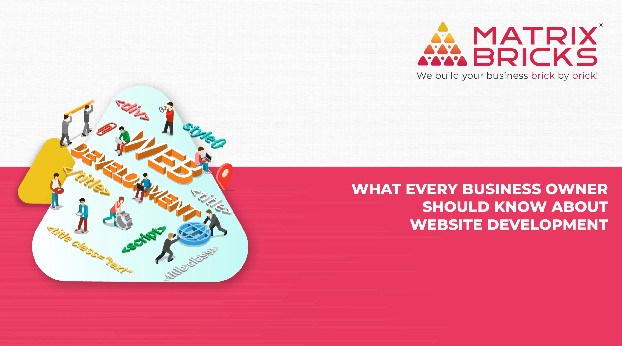
When you will search on the web, then you will find that there are two different types of projects available for website improvement.
The first and important one is building a new website. Done efficiently, the procedure needs careful planning, the joint efforts of a team of brilliant specialists, and obviously, time—normally months.
Another way to get better your website is to undertake small, but important tasks one at a time, over the period of time, on a daily basis. In case, your website is built on an accessible CMS (content management system), you must get in the practice of examining things that can be improved fast and making all the necessary changes.
Here in this article you will get all the important ideas for refining your site, so people are smoothly and quietly swept deeper into it.
Have a user-first approach
When a store, restaurant, stadium, airport, or any other place, satisfies its clients it profits from the knowledge, draws them back once more and cashes in on unfounded information marketing.
A good website has to do the same. It should deliver a best user experience (UX). You can describe UX a lot of ways, but in the try to keep it easy, I will tell you it means the client got what they arrived for without any hassles.
The remarkable thing regarding designing for user experience is you do well when the design is imperceptible to the clients. The user does not feel fussing with your site to find the Content they are after.
Your site could be attractive. The content could be the best in the business. Though, in case your website introduces needless challenges to its viewers, it is bound to obstruct your overall success.
Branding:
How your business logo is looking? Your business logo should not be puny or gigantic. And it should not be crowded by any other elements or lost in the jumble. Put it top left corner and provide it breathing space.
Messaging:
Perfectly and neatly clean up a headline. In case there is a mucky message where a concise and clear headline should be, clarify and clean it up.
Sliders are disappeared. In case you are using a multi-frame slider that kicking off your main page, it is good time to nix that old deception. Decide your most convincing message and attract readers only on it.
Credibility:
Change your stock. Do you have stock photography shattering, “we are fake” on a main page of your Website? Put a more genuine picture there.
Confirm some important points. In case you are stashing all your greatest testimonials and other types of social confirmation on one expected page or burying them in the deep, re-materialize them on famous pages where they will reach more eyeballs.
Readability:
A well written post or page may feel droning in case it is not broken up into different sections. You can add sub-headlines to get better the readability.
Lighten and whiten up. Lighten the professed “weight” of the copy by escalating white space between sections and lines. Stay away from dreadfully long and boring line as well.